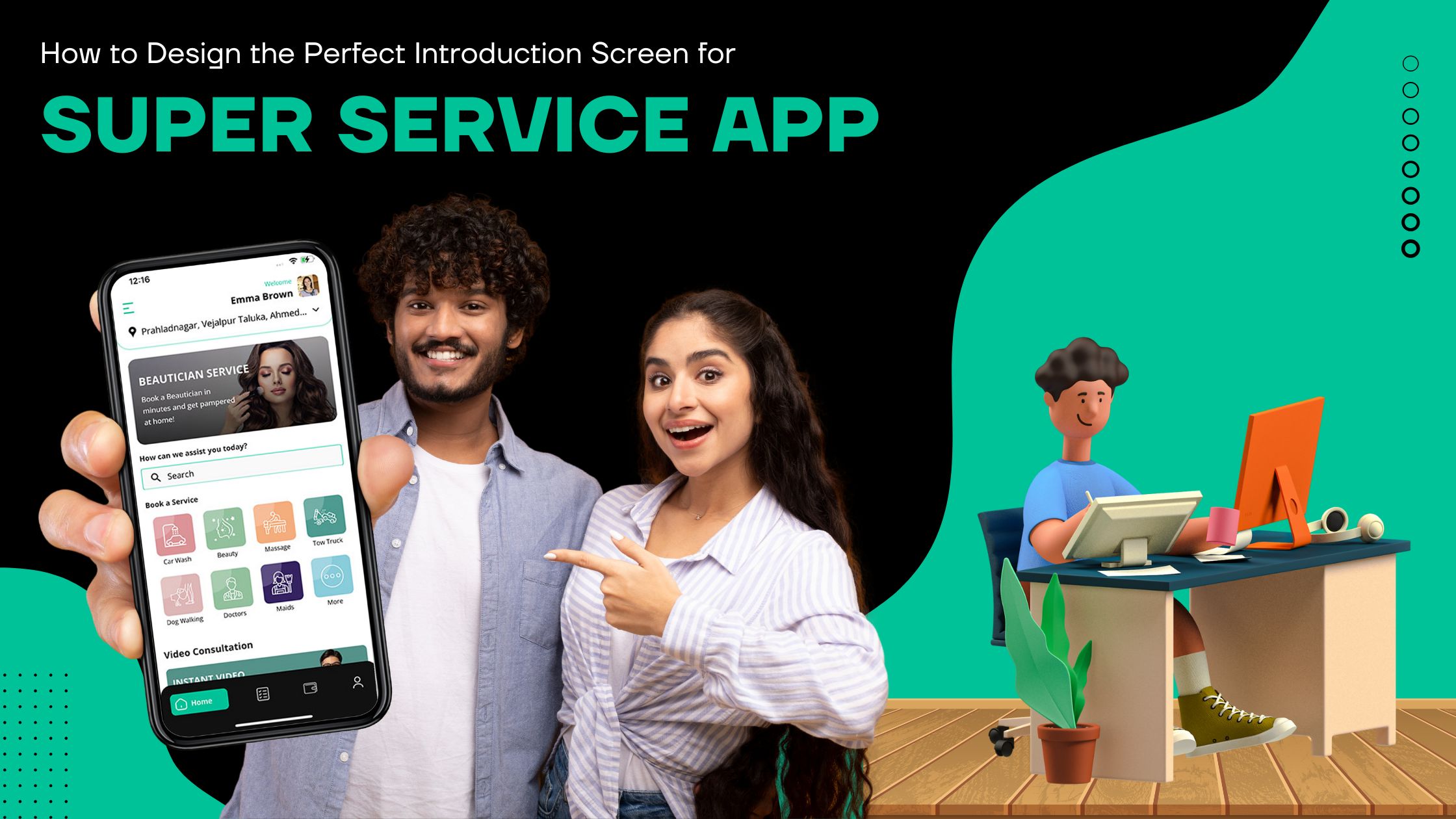
How do you Design the Perfect Introduction Screen for your Super Service App?

The first screen for your super service app is like the front door. It's your one chance to wow new users and set the right mood for a great experience. You have two choices when making the signup screens - make them difficult or make them easy. Which one you pick depends on what you want to do. This blog will explain the key role of the first screens for mobile apps and the main difference between them.
Introduction
Simple or fancy, the job of an introduction screen is to show your brand while giving new users a peek at what the app can do. Think of them as the friendly greeter welcoming you to a nice restaurant - whether it's a logo, animation, or picture coupled with a progress bar.
Impact of introduction screen on the user
A long time ago, when devices were slow and the internet was super slow, intro screens were needed to keep impatient users entertained while the app started up. Even now, with really fast tech, intro screens still have a purpose beyond just loading.
Moreover, they manage what users expect by showing there's a wait and about how long. Uncertainty makes users leave, but a progress bar reassures them that good things will come if they are patient. Also, these screens let your customers immediately immerse themselves in your app's style and personality.
Will your first screens court new users gently or make them struggle through a bunch of obstacles? The choice is yours, but it can make or break that crucial first interaction with your app. No pressure, though! By understanding the role of introductions, you're already on your way to crafting an unforgettable experience. Let’s understand in detail.
4 best ways to design an intuitive first screen
Before going forward, let’s talk about the best ways to create a great first screen, It's important to note that not all mobile apps need to have first screens. Sometimes first screens make things too difficult, especially when an app is used often.
Here are the four best ways to create first screens that welcome your visitors and create a great first impression:
Make it as short as possible
First screens should follow the 3-second rule, which states that they should not last for more than 3 seconds. If your first screen lasts for more than 3 seconds, then it will frustrate regular app users and make the user experience worse. Additionally, if you expect users to use your app regularly (at least once a day, like messenger apps), then use the 1-second rule or get rid of it altogether.
Keep simple but memorable
Since you only have 3 seconds to make an unforgettable first impression, use simple but bold designs. You need to strike a balance between overloading your users with too many different animations and creating a cold and boring first screen.
Most designers use bold colors, striking images, and animated logos on their first screens. Kindle app is a great example of a simple but eye-catching first screen. Avoid putting ads and other self-serving messages that users don't care about on your first screen.
Reduce wait time worry
When users don't know if your app has crashed or if it is still loading, there is a high chance that they will leave it. That's why progress bars and progress animations are very useful in reducing user worry. They let users know how long they need to wait, which reduces the chances of them leaving your app. If your app has a short wait time, you can use spinners, but if it has a longer wait time, progress bars are better because spinners can cause frustration when they seem to be spinning forever.
Add an element of surprise and delight
If you have enough time and money, you can add some fun and personality to your first screen. Fun animations and first screens that smoothly transition into the UI are some of the ways that you can delight your users.
7 UI/UX tips to consider of your super service app
Consider Animations
Animations can make introduction screens more engaging and interactive. Animations can introduce features, show how the app works, or just provide visual loading feedback. If you want to really impress new users with a creative, longer, complex flashy animation, you can go all out. But only do this for the very first time they open the app. For later opens, use a simpler version of the screen.
Load Only Essential Data
To reduce first screen time, only load the minimum essential data from the server needed to show the next screen.
Be Brief
Introduction screens should be brief and to the point. Avoid long descriptions or tutorials. Instead, quickly overview the key app features and benefits.
Integrate Errors
Most app errors use pop-ups, but this looks bad on a first screen and ruins the experience. For critical errors during the first screen, instantly load the next screen instead. If there's no internet to use the app, try showing the error on the first screen itself.
Make an Extended Version
It's also good to have an extended first screen that is consistent with the original one. This looks more professional while the user waits for extra app data to download.
Design Consistency
The first screen should obviously be part of the overall app design, not separated. If your app is minimalistic or black-and-white, the first screen should match.
Communicate Brand with Image
The first screen is perfect for using an image that shows how great your services are. Visuals do this better than slogans.
Conclusion
Intro or splash screens are the very first thing users see when opening your app. Knowing best practices and using creativity allows you to build brand awareness powerfully. An intro screen opens up your app gateway to users. Similarly, it improves user perceptions and strengthens brand awareness. If you want to have a highly engaging super service app, contact a professional white-label firm.


